Plancy is an innovative project management platform designed to transform complex tasks into clear, manageable stages. It's tailored for companies seeking an inspiring, intuitive solution for managing multidisciplinary creative teams, who are frequently hiring, engaging contractors, and undergoing restructuring. These companies need a flexible tool that adapts to projects and team changes while accommodating various cognitive styles. Our challenge was to develop a positioning that enables companies to focus on their projects while providing managers with real-time insights into unit economics at every stage, allowing for more accurate forecasting and sustainable team development. The core of the brand platform is process awareness at every step. We created a visual system where complex tasks are broken down into understandable, manageable layers, symbolizing the journey each task and element undergoes – fostering control and confidence.
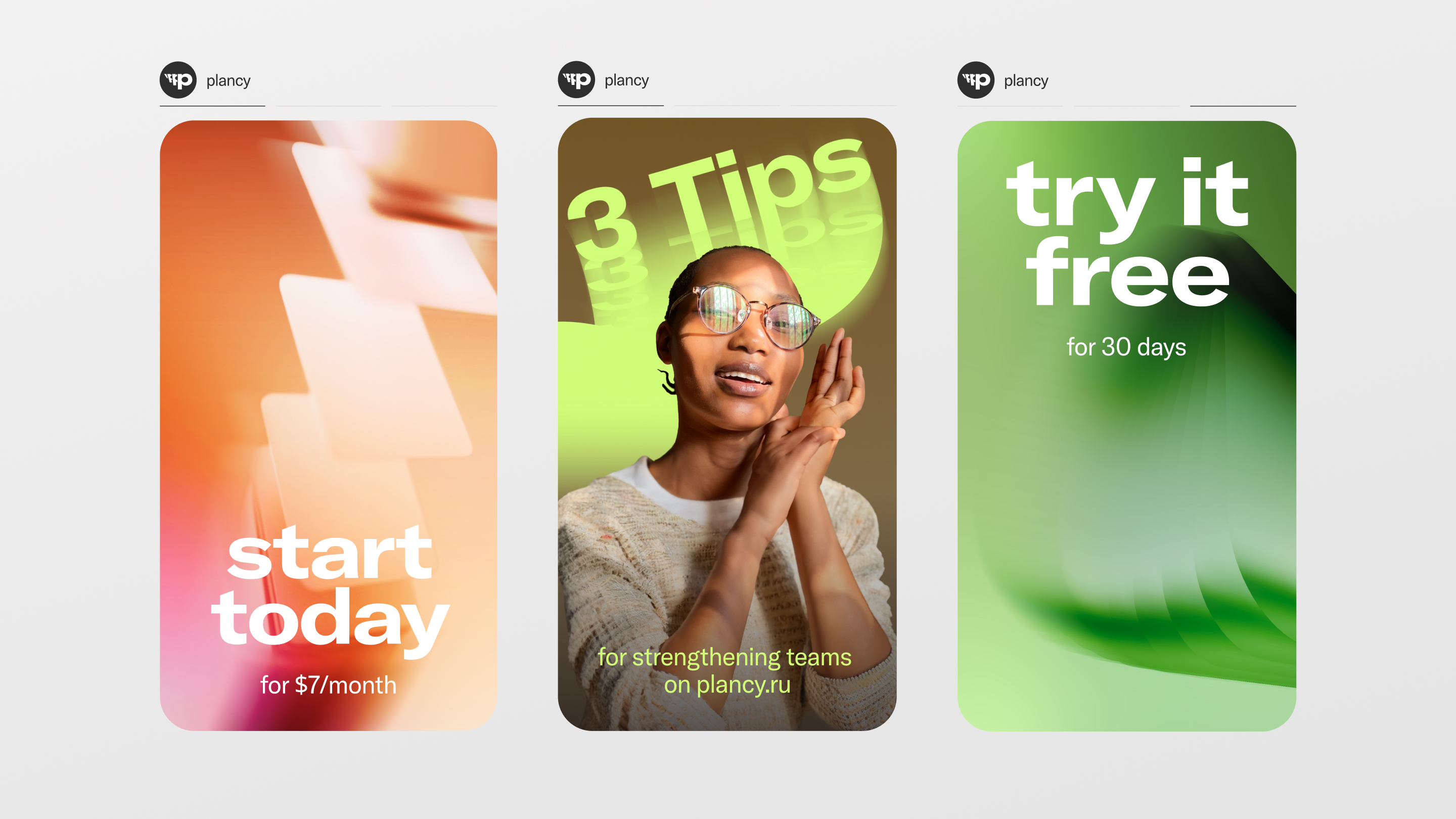
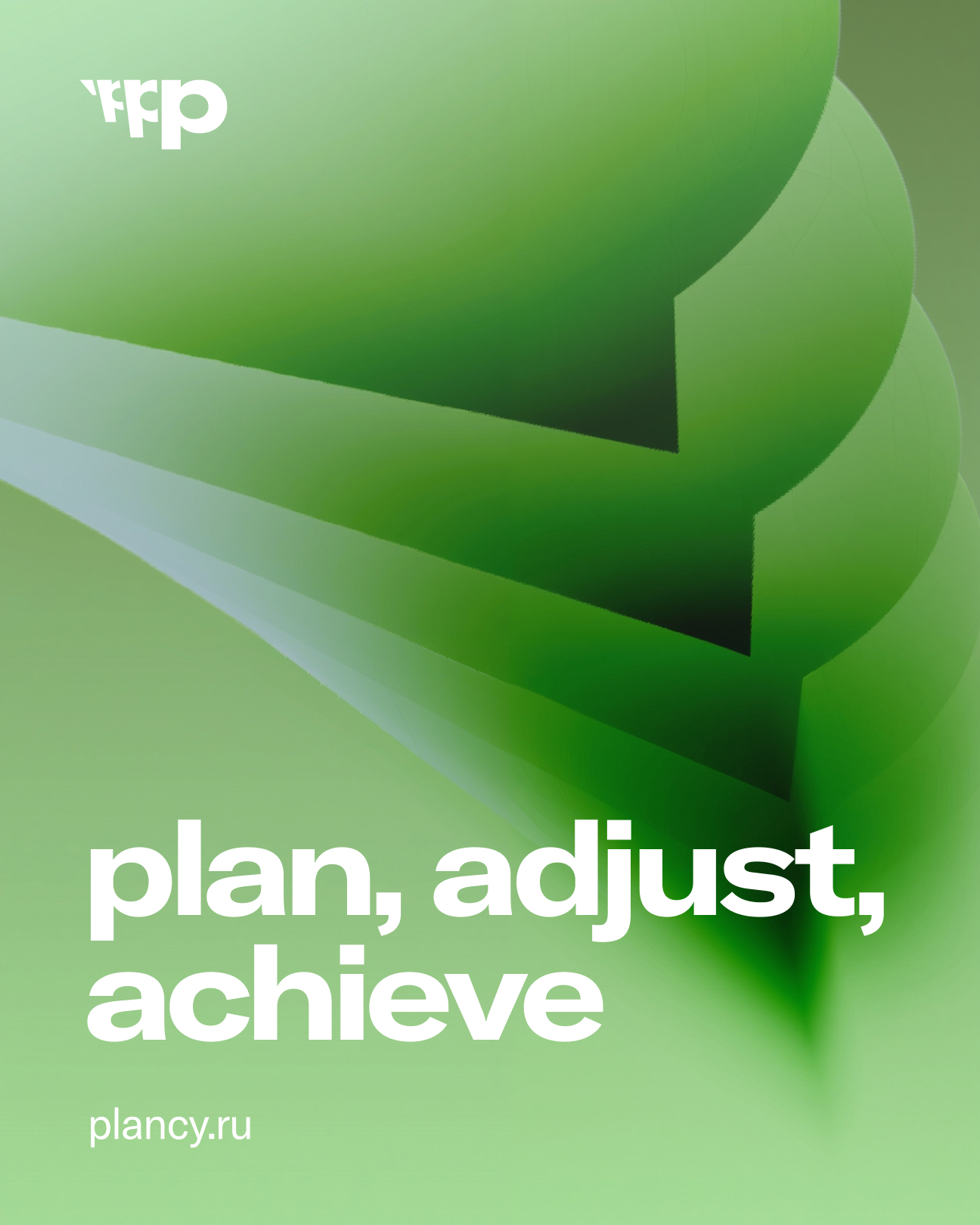
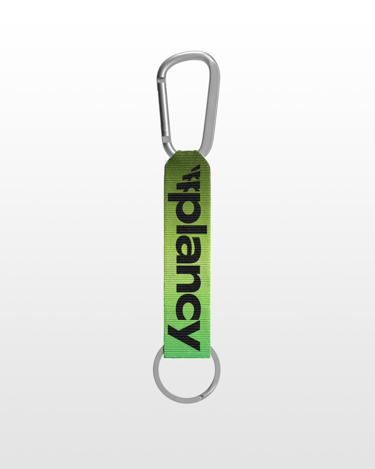
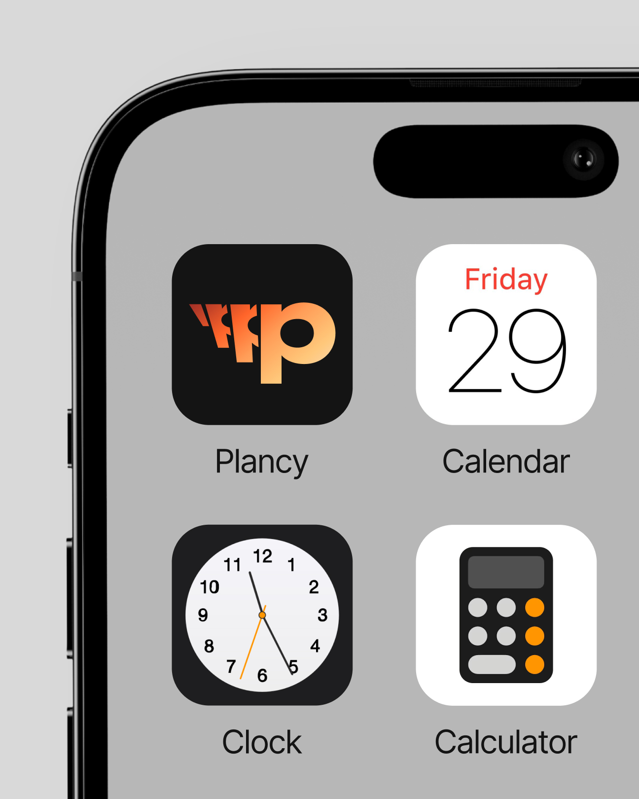
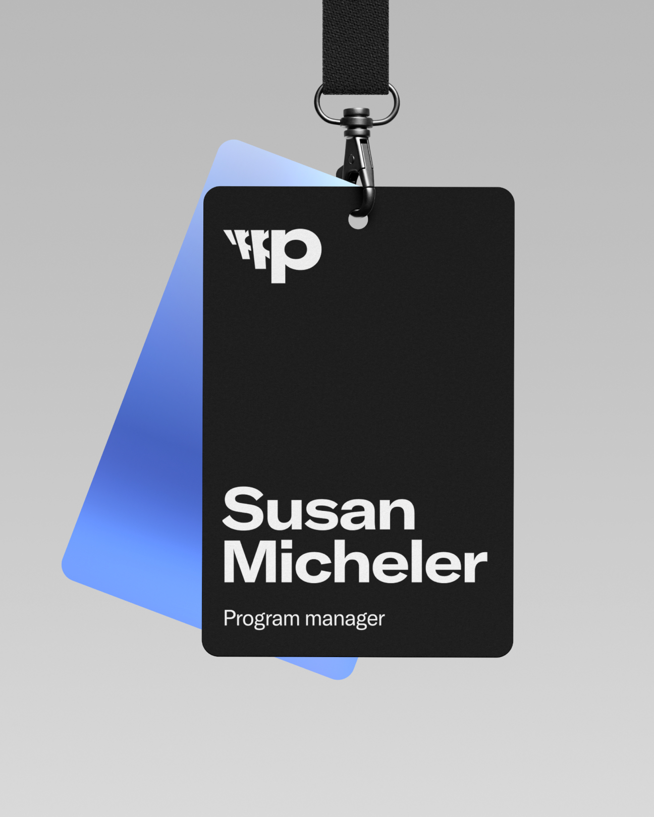
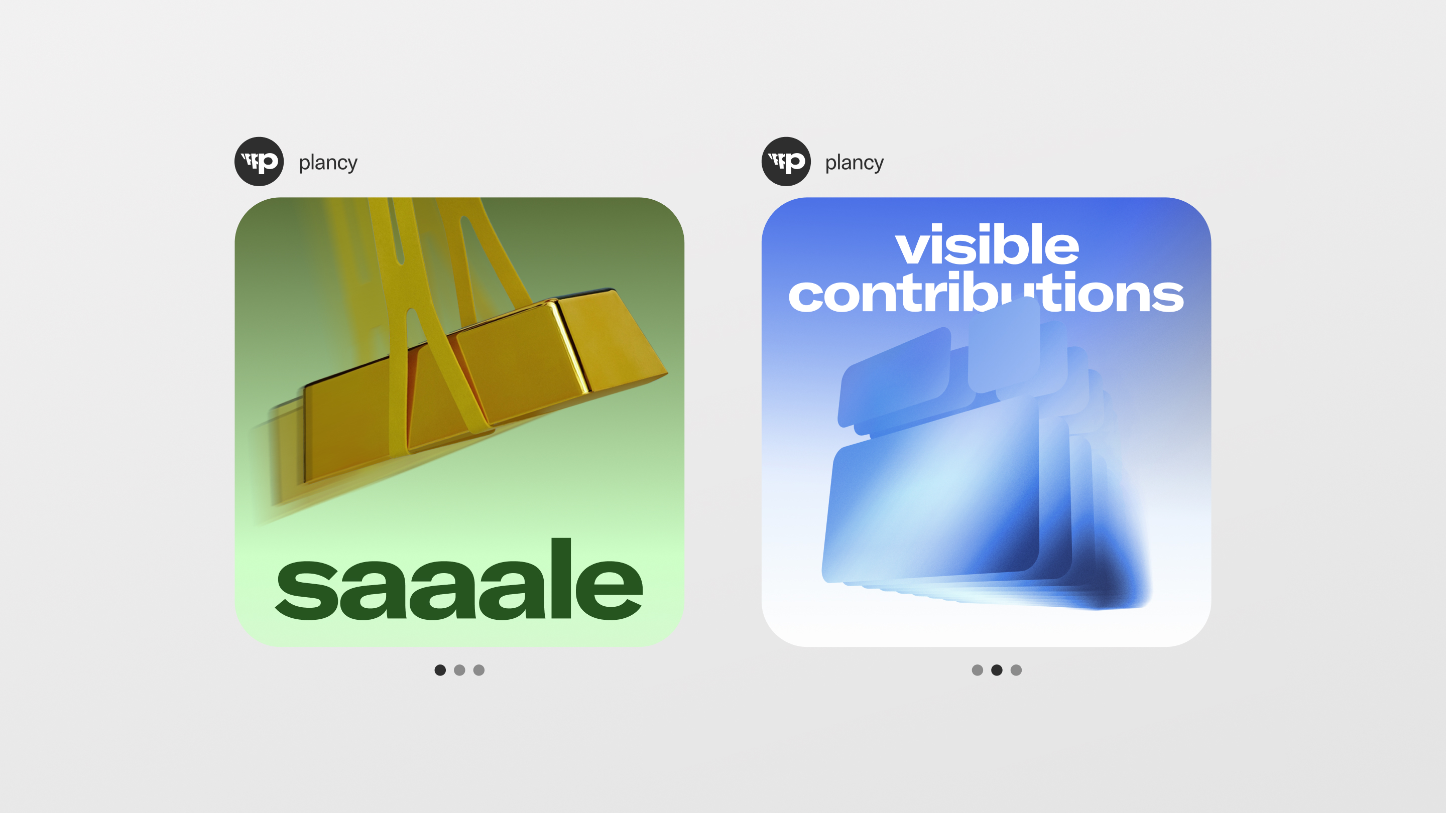
The color palette, warm yet energetic, supports this concept by balancing professionalism with inspiration. Bright, friendly tones emphasize that Plancy is not just a business tool but a source of motivation for employees. The typography reinforces the brand's identity: lively, confident, and intuitive, making information easy to process. The Plancy logo reflects the idea of infinity and forward movement, with the repetition of the letter 'p' symbolizing the cyclical, continuous nature of processes. This became a key element in the brand's visual language, extending into its identity, product marketing, and interfaces. All elements of Plancy's visual communication, from illustrations to animations, are created with the concept of multilayering in mind. We have developed a unique illustration style that supports the idea of breaking tasks down into micro-steps, helping users visualize each stage of their process. This is not just an aesthetic choice – it's a tool that makes working with Plancy easy and intuitive.
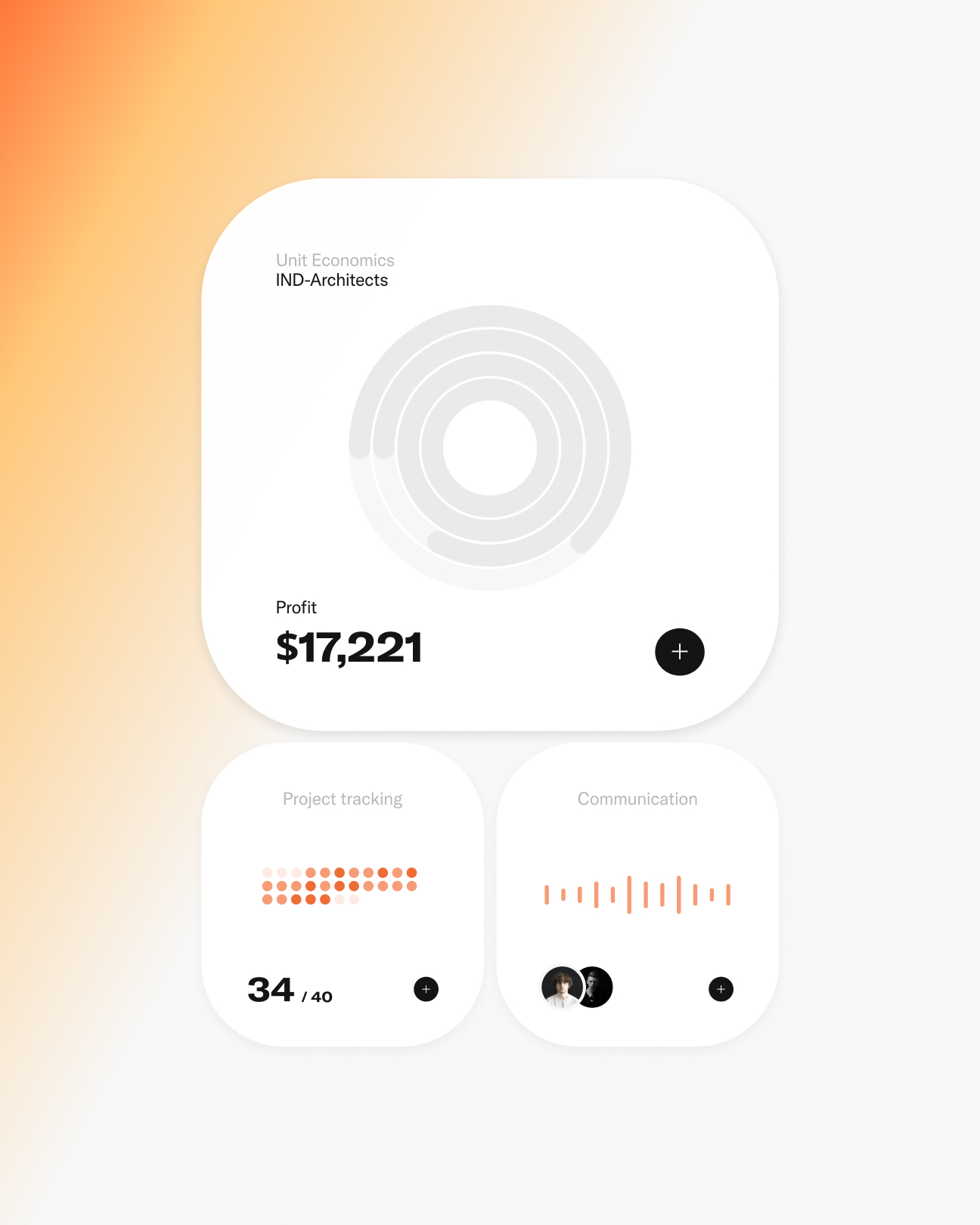
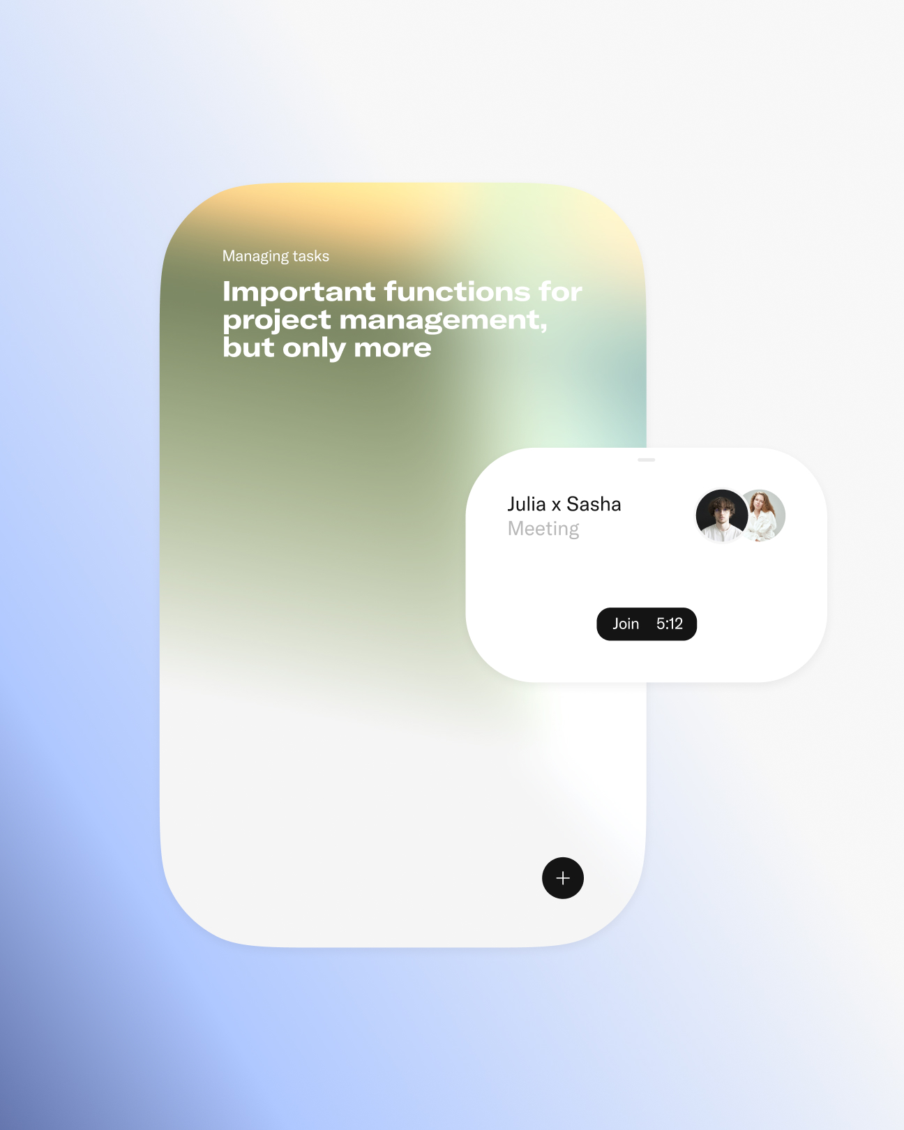
One of the advantages of working with us is the creation of full-cycle projects. We not only develop a brand strategy and its identity, but also help our clients integrate the brand's style into the product and its marketing. This ensures consistent brand development across every touchpoint. Plancy is a project where identity principles directly influenced the product marketing, creating a landing page centered around 'fewer clicks, more inspiration' idea. With just 2-3 scrolls, it focuses on delivering key information clearly. The platform is designed to meet the needs of both beginners and professionals. Newcomers are introduced to essential features through interactive widgets with brief, straightforward descriptions, while professionals can explore more in-depth details by clicking on these widgets, which open internal pages for further insights. Additionally, the interactive widgets reflect the product's interface, allowing users to explore features in a hands-on, engaging way, with each widget displayed clearly on a single card per screen. A key part of the design is the dashboard, which provides a quick overview of all available and upcoming features. This allows users to easily revisit important tools or discover new ones without needing to scroll through the entire page. This structure ensures a seamless user experience, keeping the focus on what matters most while making it easy to explore Plancy's capabilities.

VOSK Podriadchikov Vasilii (Art Direction) Alena Puraeva (Lead Design) Denis Valetin (Digital Art Direction) German Zhevmerev (Digital Design) Anton Shukaylo (Strategy) Evgeny Bryn (Naming) Sasha Bazan (Management) Maria Sorochenko (Management) Dima Rodionov (CGI) Konstantin Lukyanov (Logo Design)
