
Greymatter is led by architecture and urbanism studio LOCAL. Greymatter is vision to re-invent the places where people grow old. Greymatter want to build the next generation of healthcare facility that is open to the city, inclusive and attractive for health professional, students, younger, senior resident, and their relatives.
The places where we grow old are too often unadapted or isolated. We are still mainly aging either alone in unadapted private accommodations or segregated institutions far from other activities. Greymatter contradict the commonplace that activity and productivity is the monopoly of youth. Greymatter want to place our elders at the heart of urban renewal.
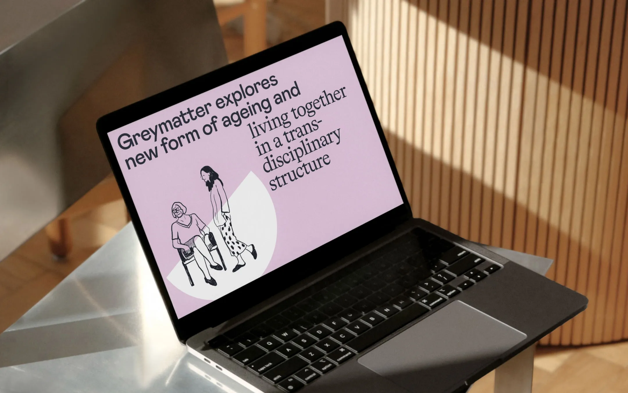
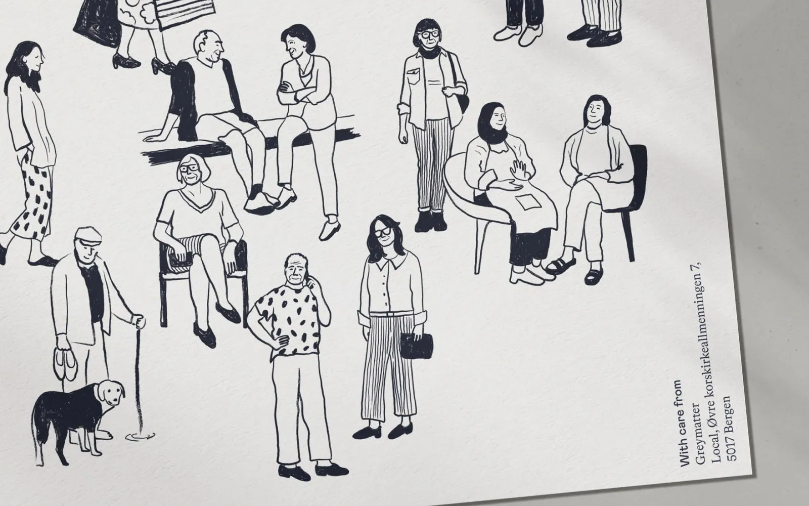
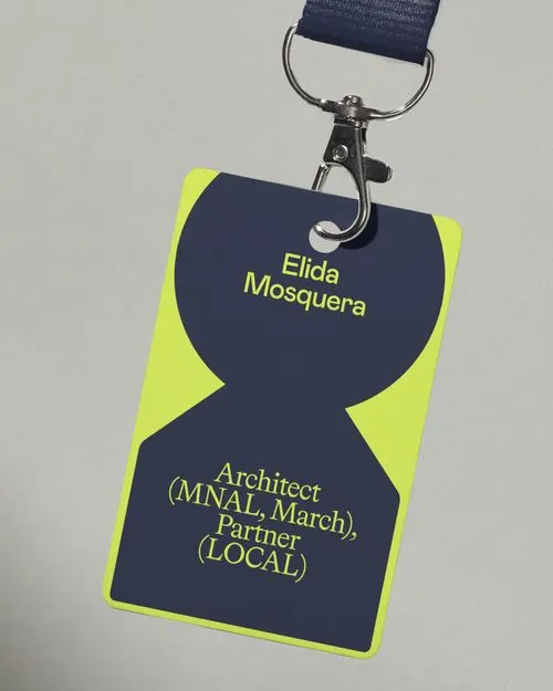
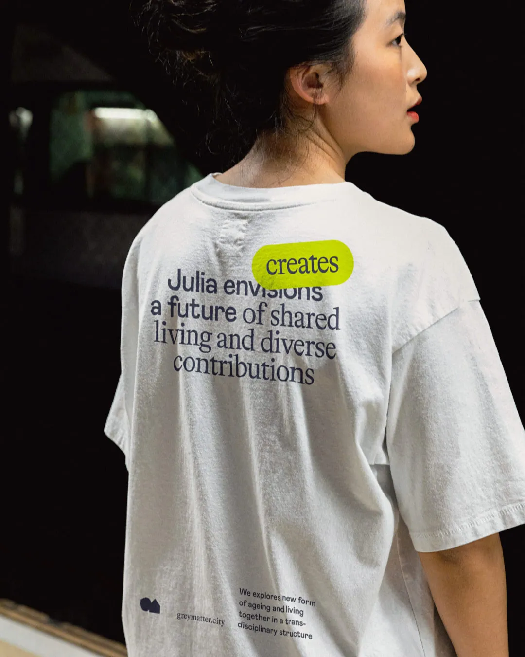
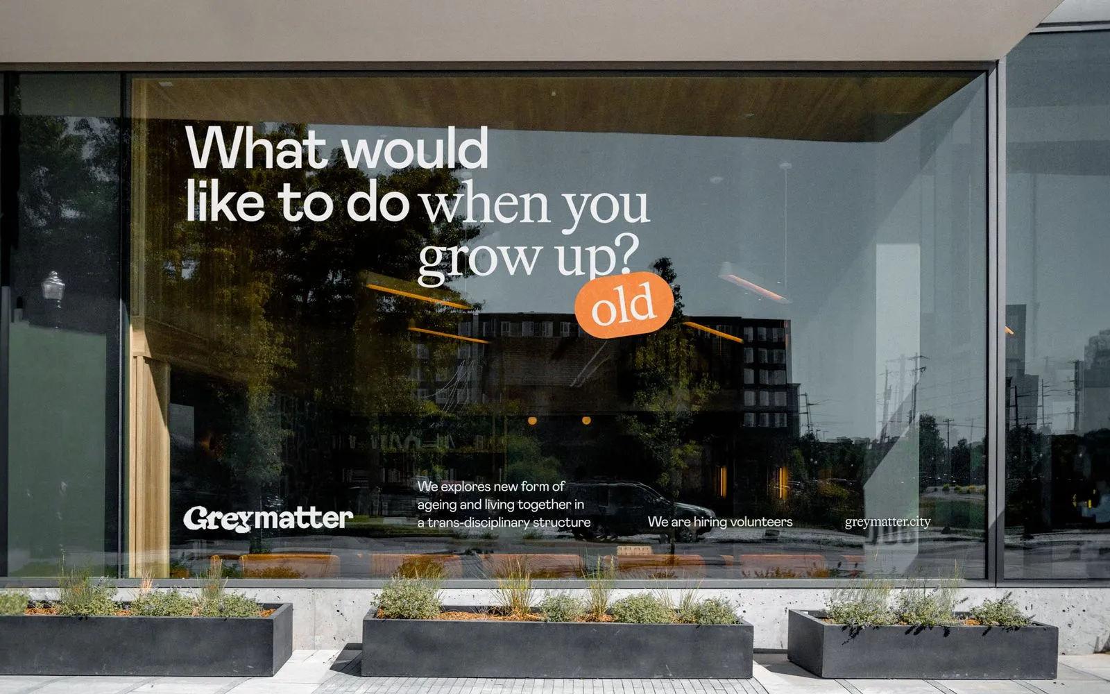
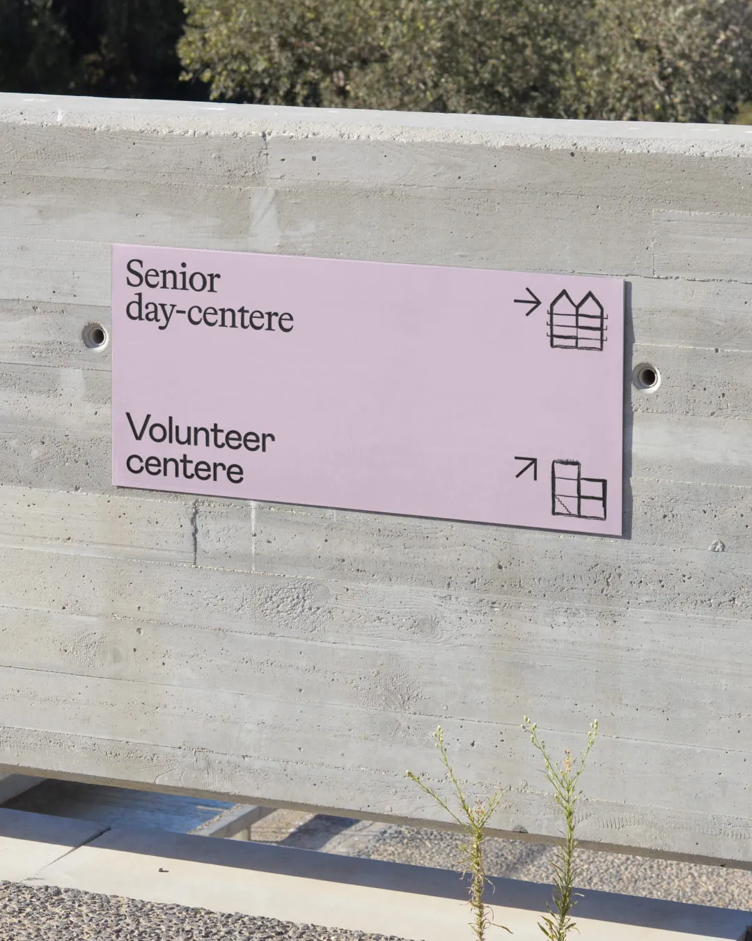
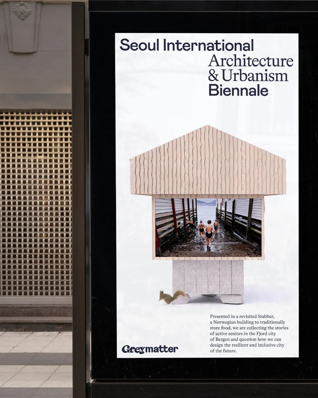
The logo illustrates the collaboration between seniors and youth to make their lifes easier. Visually, this idea is presented through a connection between a craft, sensitive serif part (Grey) and a logical, young, grotesque part (matter). Communication is based on the idea of closeness and connection between shapes. Youth and elders, children and teenagers, differently abled people. Each group has its own demands regarding urban space and quality of life. This, however, does not make development of inclusive cities impossible. Contact between shapes means sharing experiences, spending time together, enjoying life and overcoming difficulties.


Credits: Vasilii Podriadchikov (art direction & design) Sasha Bazan (design) Lisa Pautova (case design) Sasha Solncev (motion) Dima Alexandrov (motion)
